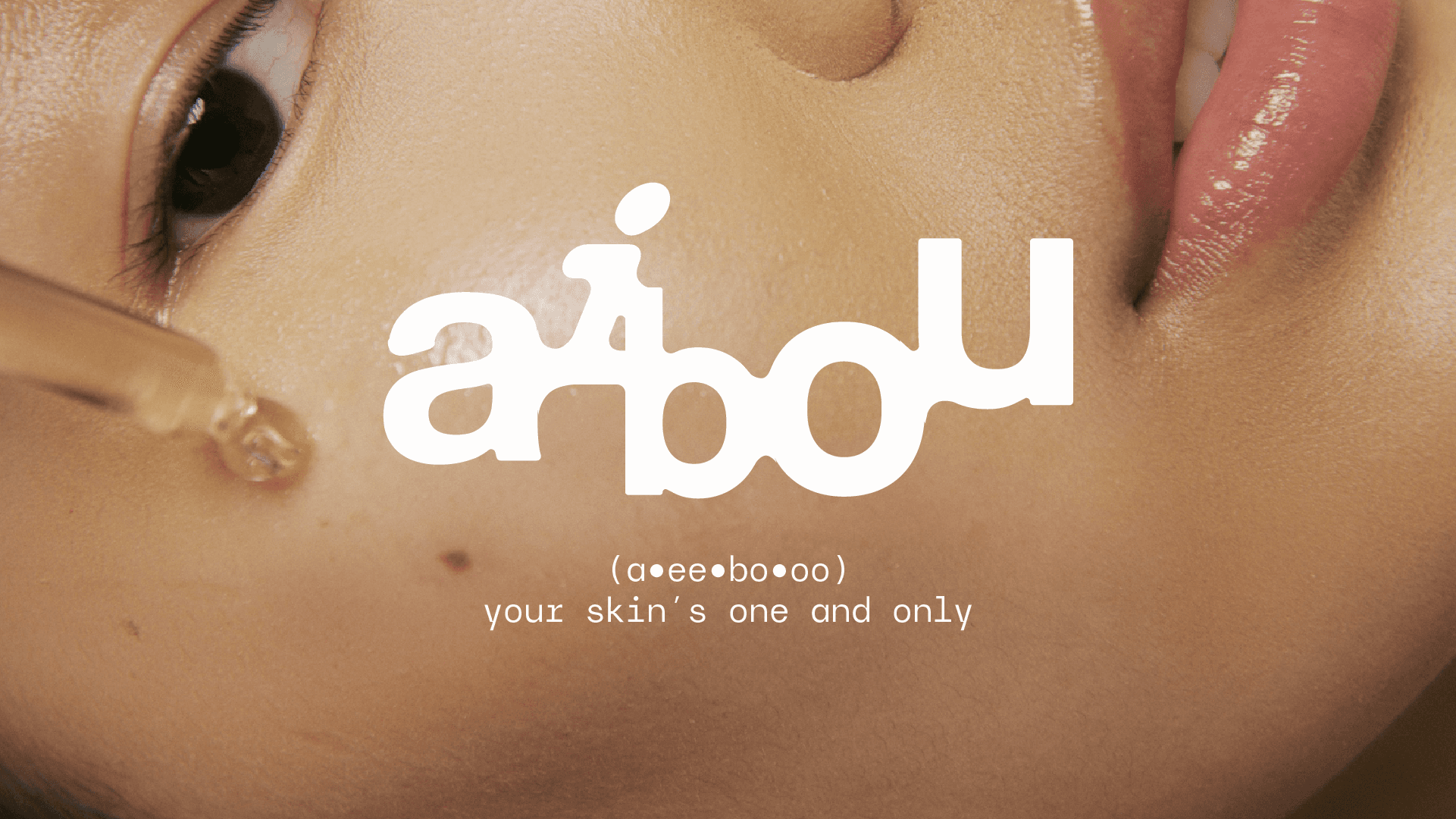
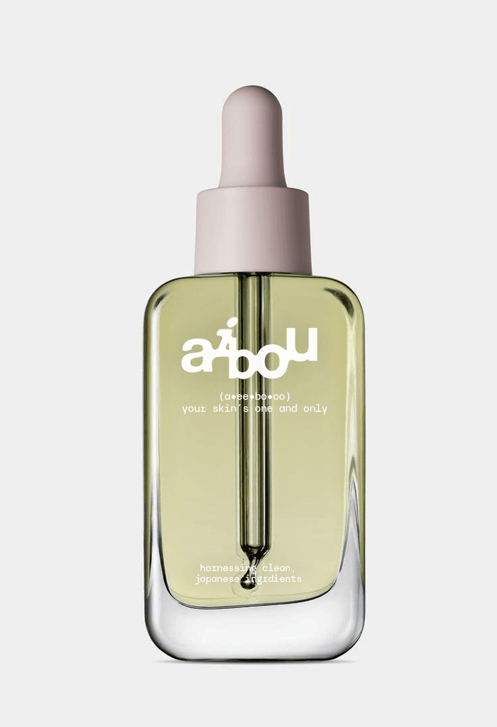
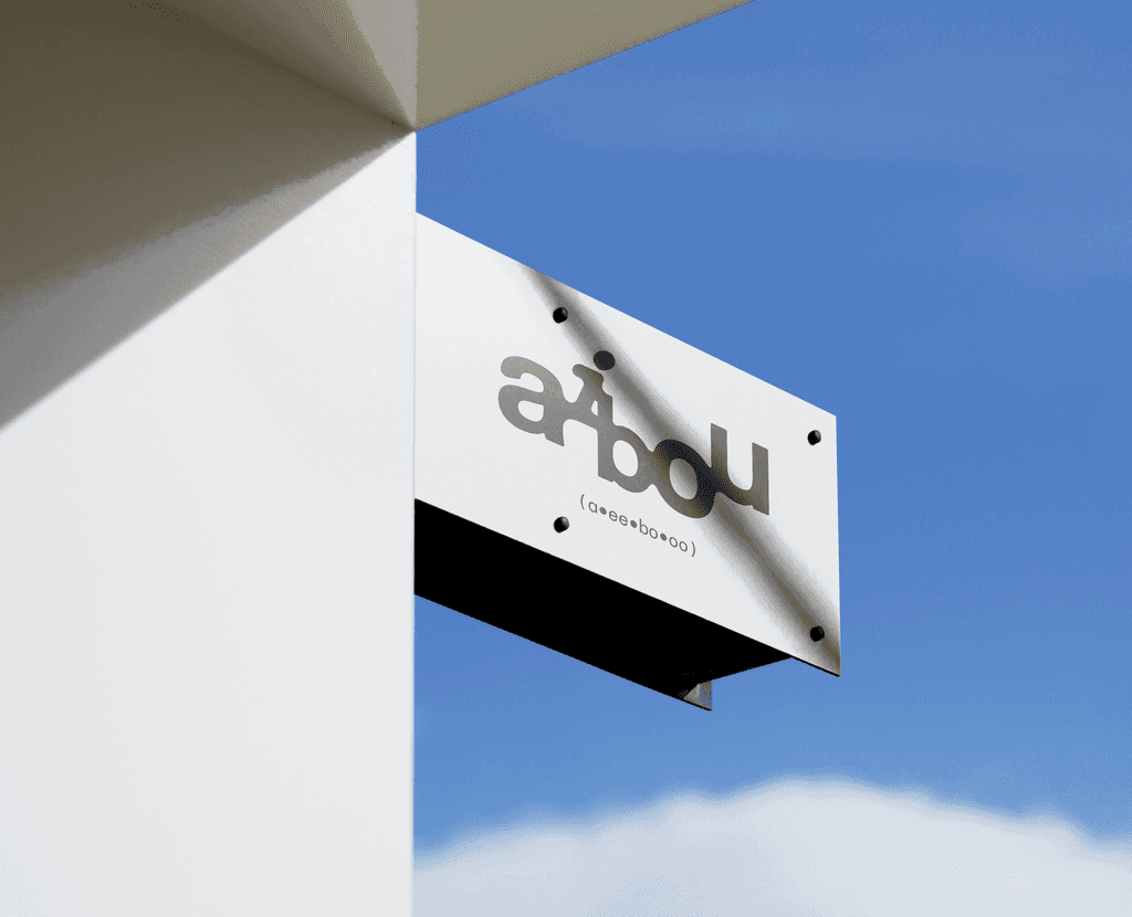
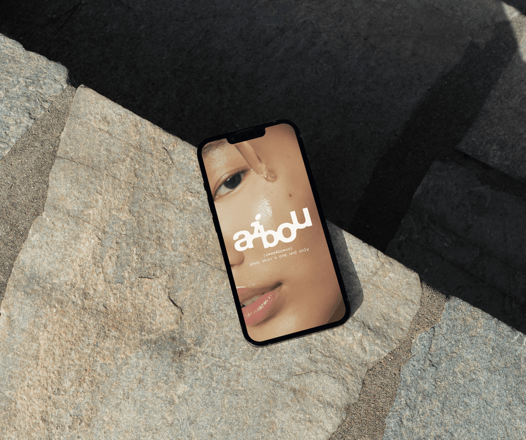
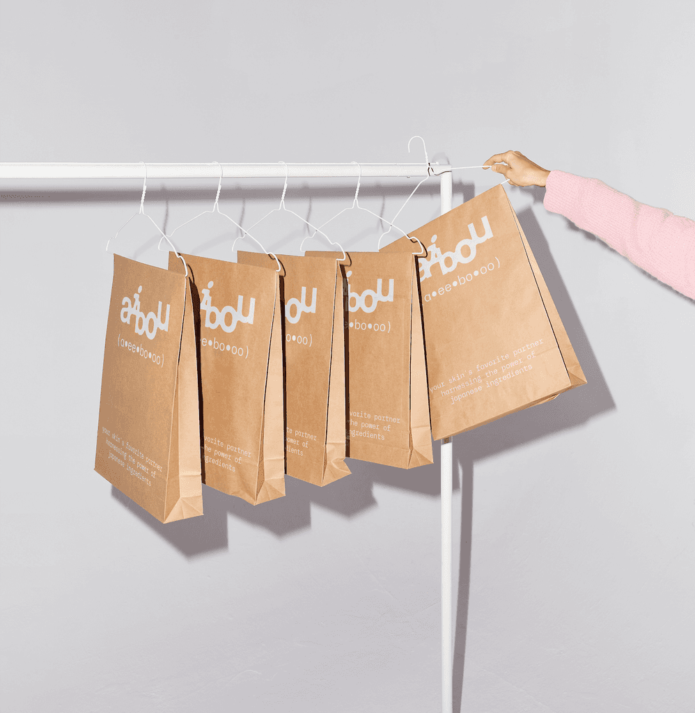
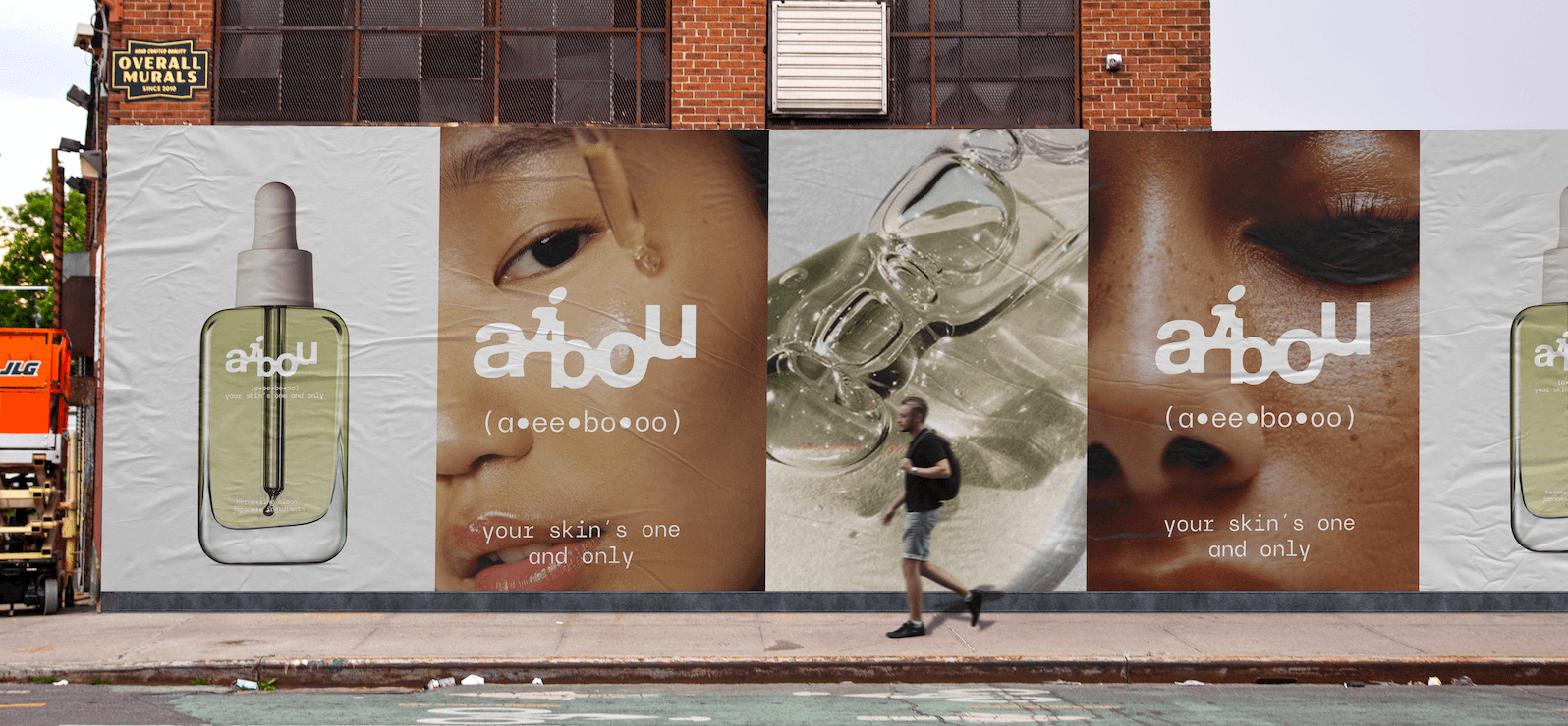
The branding and strategy for Aibou were crafted to emphasize fluidity, versatility, and adaptability, qualities that align with the brand's product being suitable for all skin types. Movement was introduced into the type and logo design to reflect this sense of flexibility, creating a dynamic visual identity that mirrors the adaptability of Aibou's offerings.
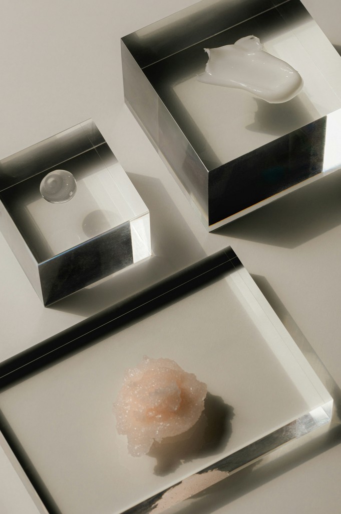
The approach integrates sleek, modern design elements while maintaining a sense of softness and flow. By allowing the typography and logo to subtly shift and evolve across various brand touchpoints, the design communicates the idea of transformation and inclusivity. The neutral color palette, combined with clean lines and minimalist layouts, provides a canvas where the brand’s core message—partnership, trust, and adaptability—can shine through in a compelling, visually engaging way.
The Aibou brand is built around the core values of versatility, partnership, and inclusivity. The visual identity captures the fluid nature of the brand’s products, which are designed to be gentle and effective for all skin types. Movement within the logo and typography creates a sense of adaptability, positioning Aibou as a brand that evolves with its users’ needs.
By blending clean, modern design with subtle, flowing elements, the branding conveys both elegance and functionality. The strategic use of dynamic type and sleek design not only enhances the brand's modern appeal but also emphasizes its commitment to inclusivity and reliability. The overall branding approach positions Aibou as a versatile, forward-thinking partner for consumers, offering an accessible yet sophisticated experience.
✦ Contact ✤
Sharp Soft Studio
LA | NYC | TKY

